App Design Project
October 2023 – June 2024 • SatoriTech
To comply with my non-disclosure agreement, I have changed some of the quantitative data and omitted some information in this case study. All information in this case study is my own and does not necessarily reflect the views of SatoriTech and/or XY Booster.
Overview
XY Booster is the first Startup Studio that promotes the diversification of technological and financial solutions towards underdeveloped segments with a vocation for self-sustainability, high impact and healthy growth. In other words, they provide opportunities for business ideas to be undertaken with investment and support from experts in the areas of finance, marketing, strategy planning, among others.
Team
- UX/UI Design team (3 people)
- Project manager
- Product owner
- 5+ stakeholders
My role
Collaborate in the UI/UX design for the app, help creating the design system, navigation flows and information architecture.
Timeline
October 2023 – June 2024
Problem & Objective
Getting more investors
The main objective of the application focused on the philosophy of attracting potential investors to move forward the projects within the company’s portfolio. By having a broad portfolio of projects, the diversity of interests and possible investor profiles is wide, with this, it is not only intended to get people to invest, but to generate a community driven to help projects that can benefit people.
Business requirements
- Create a visually appealing and professional application.
- Prioritize inviting people to become investors in projects that are interesting to them.
- Generate community: Share news, newsletters, and relevant information with investors or members of XY Booster.
- Create an enjoyable and personalized registration process for the potential investor/member.
User goals
- Show XY Booster’s portfolio projects as the main point of attraction.
- Make the invitation to become a member of XY Booster simple and concise and then invite them to invest.
- Give them the possibility to have support and attention in key moments of navigation.
- Create a gamification system to invite to invest in more investment options or XY projects.
My responsibilities
- Assist in the creation of a design system for XY products.
- Collaborate in the visual identity of the application with graphic proposals.
- Create navigation flows and test them.
- Collaborate in the determination of main and essential features for the first version of the application.
Market research
Understanding investment apps
Although XY Booster is an application that does not allow you to manage and invest directly through the application itself, it was important to understand what other investment-themed applications do that can help us with our goal.
Takeaways
- Investment applications at all times make it clear why they require some personal information for, what the user can expect within the process, and how to proceed with it.
- There are always several ways to contact a support person or ask for help if a problem occurs.
- The information on investment options is concise and clear.
- Many of these apps do not have a gamification system.
Process
Building the first version
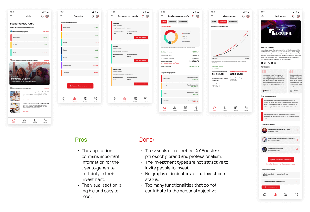
In order to understand how to visually design the app, several tests were performed. The application had different versions in which features were added and removed in an attempt to reach an agreement on the essence and objective of the application. Based on these iterations, the first version of the prototype was created.
Testing
First analysis of the results
Out of a total of 5 people, we chose to informally test the first version of the app to get feedback from users with diverse profiles. Some were familiar with investment applications before, and some others had never had an approach to a similar application before.
60%
They found the app confusing to navigate and in some sections they didn’t know how they could use them or how it was useful for them.
100%
Considered that having help and being able to contact support was paramount in the absence of being able to know the status of the investments.
60%
Found it confusing to know what exactly they were investing in. The projects did not seem attractive to them or they simply did not know what they were about.
Takeaways
Focus efforts on supporting the user in a textual way to understand the purpose of the processes and be more concise with the information. Support from the product owner was required to get to know the investment products in depth and their internal processes.
Make the investment projects section more attractive to create a connection between potential investment and the project that may be of interest to the user.
Unfortunately, the investment status information was discarded due to changes in the company’s internal processes. We had to work on a way to give certainty to the user certainty even if he does not know how his investment is going.
Current product
An app with greater cohesion
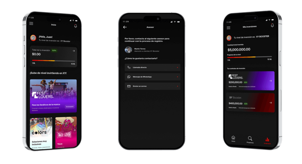
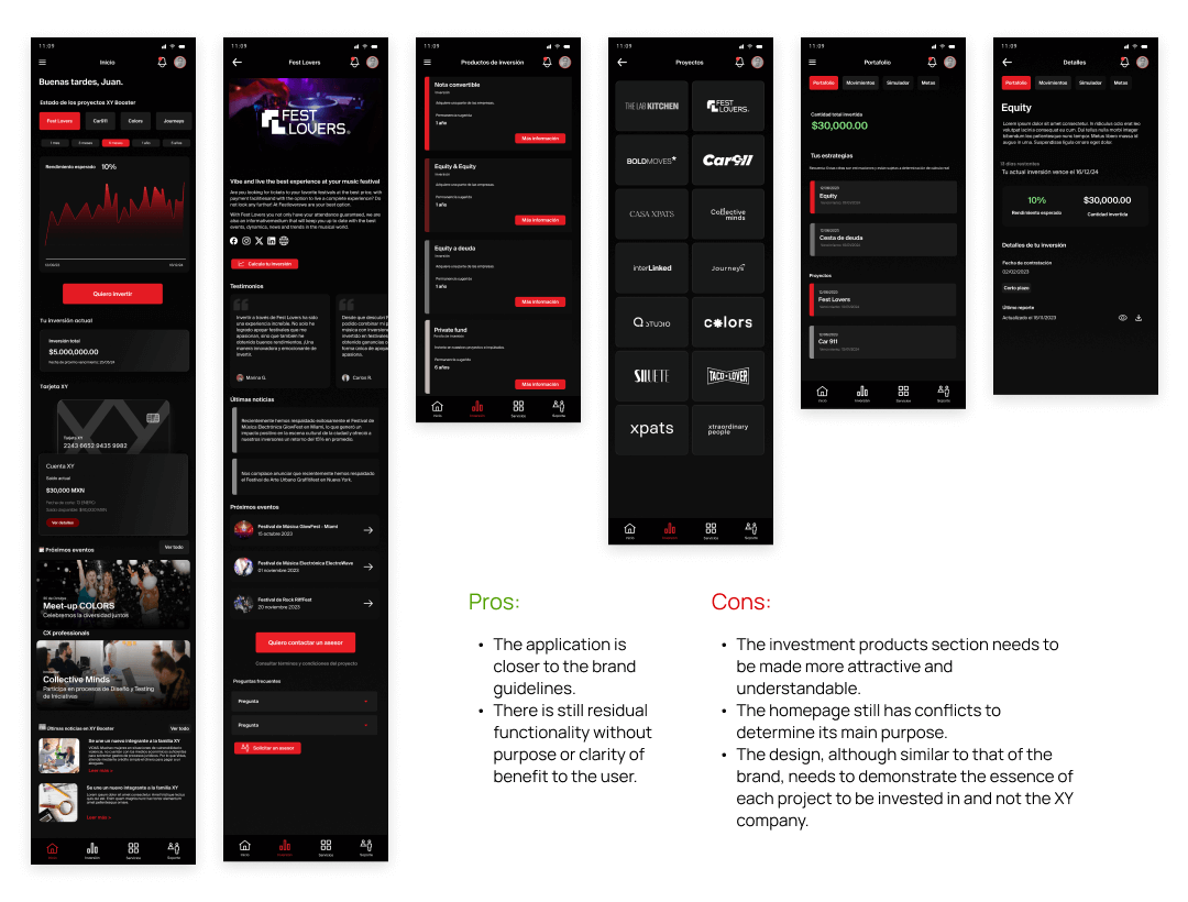
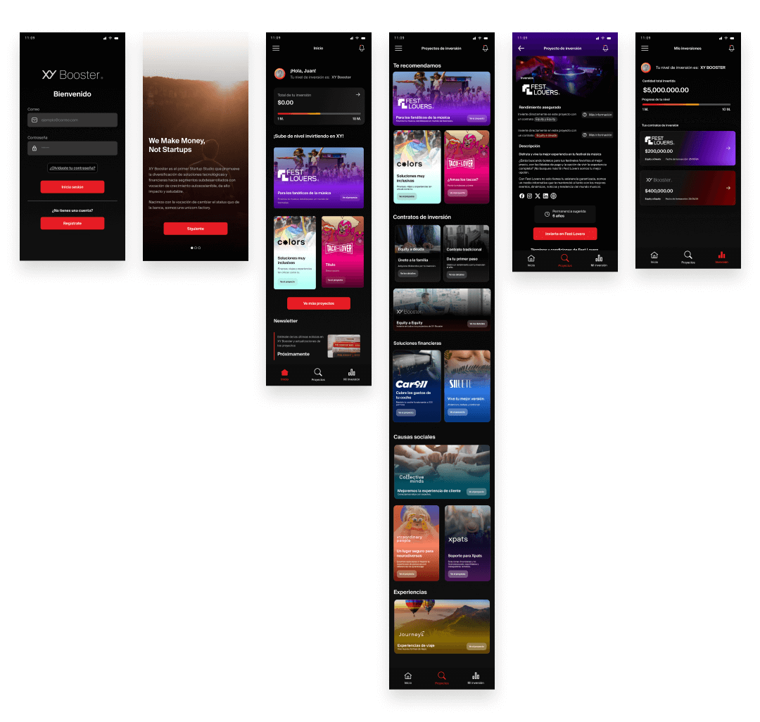
After design and navigation reviews with stakeholders and testing, the current design had adjustments in the information architecture, the visual mode of the application was changed to a dark theme and adjusted to the current brand identity. On the other hand, an improvement in the presentation of investment products and projects within the company’s portfolio was achieved.
First version of the prototype with dark mode
Improvements
- The project now has a clearer focus on the objective.
- The screens have more descriptive and user-friendly text to help the user understand how to navigate and what to expect from the processes.
- The information architecture became more purposeful and categorized thanks to the collaborative work of the stakeholders with the team.
- Functionalities that prevent the development team from moving forward and that need further definition were eliminated.
Testing
Testing the hypothesis
From a poll of 5 participants, this test was conducted informally with people around ages 20-30 , the average age of XY Booster investors. I gave a brief explanation of what can be done on this app and a task to complete, I asked them to explain their thought process on real time and some follow up questions. Here’s a summary of our findings.
60%
Were able to navigate and find easy a product to invest on-
80%
Thought that the projects and their presentation were interesting/attractive, and all the detailed information about them made it easier to make a decision.
80%
Believed that having someone from customer support always available to answer questions or doubts was key to make a decisio and feel their investment to be on good hands.
80%
Wish they could see a tracking of their investments in real time or a frequent update on their app without having to contact someone to give them that information.
Project takeaways
Lessons learned
- The development and concept of an application can be affected when there is no clarity in the objective and scope of the requirements. Working in ambiguity affects the progress of the project.
- This was my first approach working on an application with dark mode, with it I got a lot of learning in user interfaces.
- It is important not to go out of the design line of a brand. It can affect the perception and trust of the brand if a product does not match the rest.
Next steps
Recent launch
The app has recently been released to the app stores and is expected to have a grace period to learn about XY Booster members’ experiences with the app.
