App Design Project
October 2023 – February 2024 • SatoriTech
To comply with my non-disclosure agreement, I have changed some of the quantitative data and omitted some information in this case study. All information in this case study is my own and does not necessarily reflect the views of SatoriTech and/or The Lab Kitchen.
Overview
Founded in 2023. The Lab Kitchen is a startup whose mission is to offer businesses and corporations to their HR departments a suscription that includes cakes for every employee and calendarized events. Their value offer is using data to calculate the best menus and ingredients for everyone in the corporation based on the taste of every employee.
The Lab Kitchen project has an ecosystem of 4 digital platforms for different purposes. A website that sells the product to businesses, an App for the employees that it’ll help to define their taste and food interests, a control panel for HR to config their employees and calendarize events and an admin for The Lab Kitchen that helps them keep track of orders, their clients and the best options for menu.
Team
- UX/UI Design team (3 people)
- Project manager
- QA
- 2 stakeholders (founders of the startup)
My role
UI/UX Design for the app, navigation flows.
Timeline
October 2023 – February 2024
Problem & Objective
An app for a unique startup
The Lab Kitchen has a unique value proposal and their ecosystem has to work seamlessly in order to attract clients.
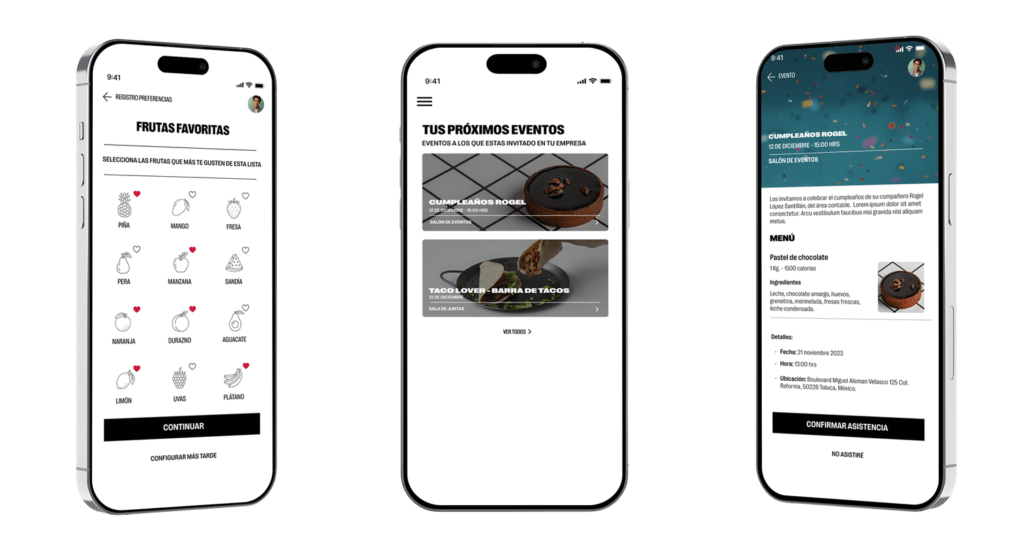
This app is specially designed for the employee, the only way they can access to it is if their employer bought a suscription, and its main objective is to know the preferences about food, fruits, vegetables, allergies and their personal nutritional objectives.
Bussiness requirements
- Follow the design alignments of the brand.
- For Phase 1 of the app, primarly focused to obtain the user preferences.
User goals
- Make the registration of their preferences as simple as possible.
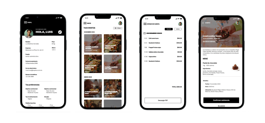
- Find the next events from their employer they’re invited to and choose to reject them or accept.
- See what the menu for the event is.
My responsibilities
- Create a design test to choose the best way to proceed
- Define the user flows
- Test with users
Market research
What are others doing?
The Lab Kitchen market is new, and competition only offers a website to promote their services of catering, industrial dining, and cafeteria, most of them with pre-established menus.
Takeaways
- The value of The Lab Kitchen is in the personalization of menus, based on everyones preferences and personal objectives. Competition only offers pre-established menus, mostly healthy ones.
- Competition would offer a one-time service, either catering, or dining. Birthday celebrations for the employees and calendarized events are not considered.
- Competition wouldn’t take employees preferences into consideration for the menu.
- Lack of information about menu ingredients and nutritional data.
Testing
Results
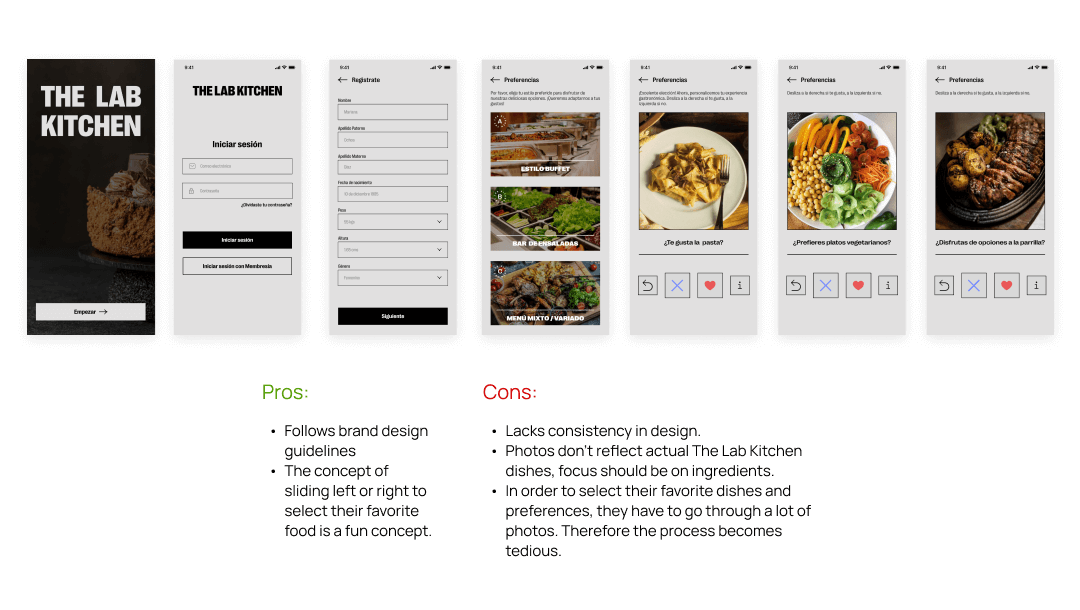
From a poll of 5 participants, this test was conducted informally with people around ages 20-50. We explained to them the objective of the app and asked their opinion on the flow.
60%
Thought the app was hard to read due to the grey background.
60%
Didn’t find the process to be enjoyable and thought the left and right swiping was frustating.
20%
Thought the process was easy.
Takeaways
The use of photographs confused some participants about the purpose of the question.
Process had to be quicker and simplified. Users asked to let them choose options or write them.
- Left and right swiping didn’t work as expected and we needed to find a new way to select preferences.
Current product
Better experience for the user
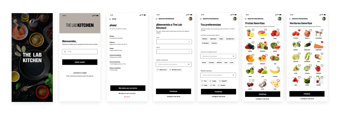
After revisions on design and navigation with the stakeholders and the testing we did, the current design had adjustments in the architecture of the information and UI design was changed in favor of readability.
First Iteration.
Second iteration.
Improvements
There’s no longer a process where people have to write their personal information. People are given a code to access the app and they’ll only need to confirm their information.
User can still choose favorite dishes and ingredients in a visual way. Swiping was discarded.
- Process is easier and more intuitive.
Testing
Testing with real people
From a poll of 6 participants, this test was conducted with people with similar characteristics to the ideal user persona. I gave brief context what The Lab Kitchen is and a hypothetical situation where they’re ask by HR to download the app and fill their data. I ask them to walk me through their process and experience using it. This is a summary of the results and insights.
83%
Thought the process was easy to follow and quick to fill their information.
66.4%
Found the information shown on the detials of events to be important for them to choose to participate or considering eating the food served
100%
Thought that navigating through the app was intuitive and pleasant to use on an every day basis.
Project takeaways
Lessons learned
- Knowing how the ecosystem and behind the scenes of the service can improve the usability of one of the products.
- Sometimes a fun concept is detrimental for the user needs and experience.
- Asking the right questions to get the right answers is an important process of communication with stakeholders and my team.
- A product can easily change when another product in the ecosystem changes its purpose.
Next steps
Testing the ecosystem
The Lab Kitchen is still in development and will be tested in one company. It is expected to have more phases where services are going to be included and users can buy directly from the app.


