Landing Page Design
December 2023 • SatoriTech
To comply with my non-disclosure agreement, I have changed some of the quantitative data and omitted some information in this case study. All information in this case study is my own and does not necessarily reflect the views of SatoriTech and/or Workcap Solutions.
Overview
Workcap Solutions is an institution that offers financial credits for small and medium size businesses to help them liquidate debts, start new businesses or offer them a credit for the needs they could have.
Team
- UX/UI Design team (3 people)
- Project manager
- 1 stakeholders (CEO)
My role
UI/UX Design for the landing page, information architecture.
Timeline
December 2023
Problem & Objective
Better information delivery
Workcap Solutions current landing page has a set of problems were the most relevant information for the users and the understanding of the business comes after scrolling for a few seconds, which has provoked less contact from potential clients.
Also, the visual design of the page seemed outdated and didn’t deliver the professionalism of the brand.
Bussiness requirements
- Modern and more professional visual design
- Better architecture of the information.
User goals
- Deliver information in order to be easier to find
- Less scroll to find the contact form.
My responsibilities
- Create diverse visual design test to choose the best way to proceed.
- Define the information architecture for the user.
Market research
What are others doing?
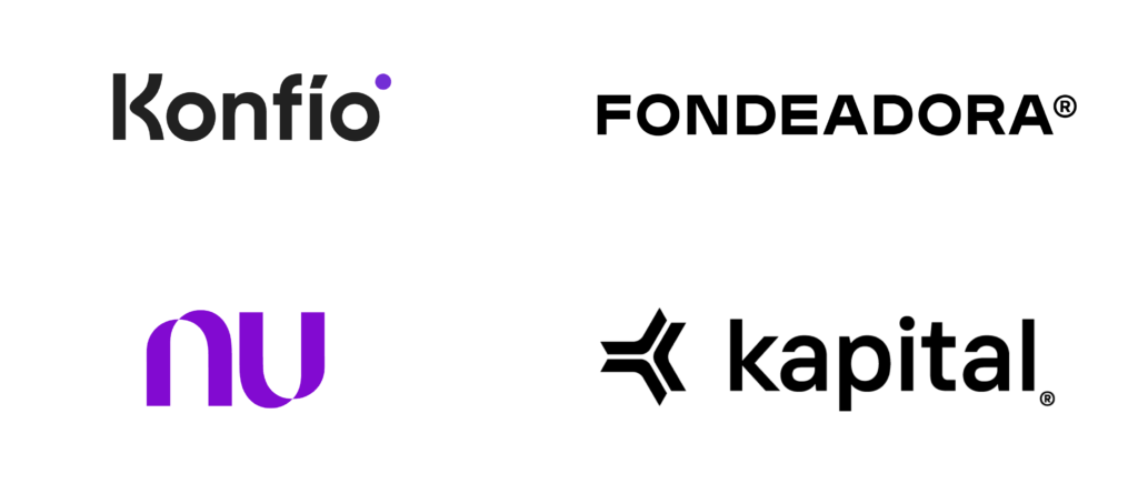
Workcap Solutions market competitions offer similar products, most of them have clear, attractive and straight forward delivery of information. Workcap was falling behind as an untrusted website.

Takeaways
- Competition services is the first delivery of information for the users and concise.
- Information regarding the brand missions and visions, or financial permits is relevant for the user but almost always is at the end or in a dedicated page (in case of websites)
- Calls to action are clear and more inviting.
- Visual design aligns with a friendly, clear and professional look that evokes trust in the user.
Process
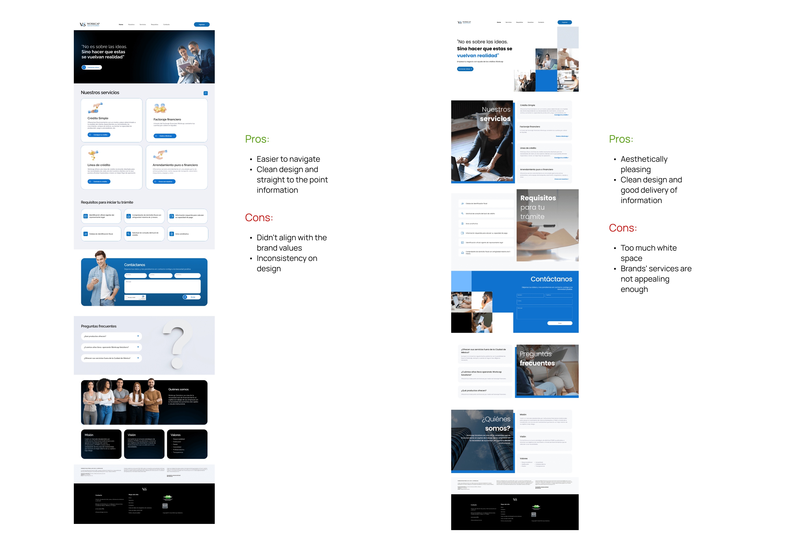
First design tests
Primary focus was to create a visual identity for the brand that could look clean and professional, since Workcap at the moment of the creation of the landing didn’t have branding guidelines and seek a way to deliver the information in a better architecture for the user with a few constraints in the change of texts.
Design before the redesign
First iterations
Results
From a poll of 5 participants, this test was conducted informally with people around ages 20-50. We explained to them the objective of the landing page first designs tests.
50%
Thought the landing page was a e-learning platform. (reminded them of another brand)
60%
Thought some sections were unnecessary or occupied too much space and didn’t care much for the information in them.
20%
Thought the design was “off-brand”, although they weren’t able to pinpoint why.
Takeaways
The use of some photographs confused some participants about the services of the brand.
Branding can influence the trust of users and the kind of service the brand provides.
- There is information that users don’t need immediately, either because they don’t understand the concepts or don’t care for it, so it doesn’t need to use much space.
Better delivery of information
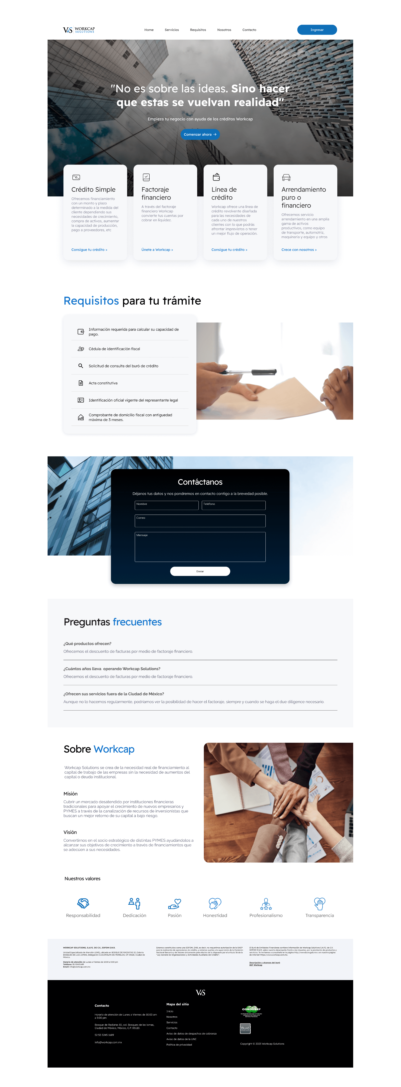
After revisions on the designs and navigation with the CEO, and he testing we did, there was a need to redesign the whole landing page with some adjustments in the architecture of the information.
Improvements
Visual design is clearer, and there’s more personal call to actions that lead to the contact form.
Most irrelevant information for users (but important for the brand) has its own section.
- Focus on more visual elements such as icons and photos.
Impact
Measuring impact
+21%
Calculations of loans inside the website
+15%
Contact forms filled
-30%
Less bounce rate compared to the past 5 months before the redesign was launched.
Project takeaways
Lessons learned
- Working with a brand without visual guidelines is always a challenge, but it’s important to remember that both the user and the brand need to win in the design process.
- Every section and piece of information counts.
- Looking at what the market is doing is always a good point of reference to understand what users are looking for.
Next steps
Live website
Workcap Solutions new landing page now live, you can visit it in the link below.


